matplotlibで散布図
matplotlibで散布図を描く方法について。
Definition :
plt.scatter(
        x, y,                 # x座標, y座標の配列
        s=None,               # マーカーのサイズ
        c=None,               # マーカーの色
        marker=None,          # マーカーの形
        cmap=None,            # cがfloat型のときのカラーマップ
        norm=None,            # cをfloat型配列にした時の規格化インスタンス指定
        vmin=None, vmax=None, # 最大・最小
        alpha=None,           # 透明度
        linewidths=None,      # 線の太さ
        verts=None,
        edgecolors=None,      # 線の色
        hold=None,
        data=None,
        **kwargs)
色名一覧はここ
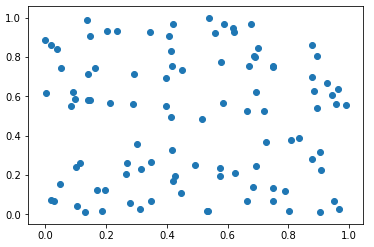
・乱数で100個の点を描く
import numpy as np
import matplotlib.pyplot as plt

x = np.random.rand(100)
y = np.random.rand(100)
plt.scatter(x, y)
plt.show()
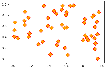
・マーカーをひし形にして、色を付ける。
x = np.random.rand(100)
y = np.random.rand(100)
plt.scatter(x, y, s=100, c="orange", edgecolor="red")
plt.show()
・直線、軸、タイトルつき。
import numpy as np
import matplotlib.pyplot as plt
#日本語を使う場合は以下の2行でフォントを準備
from matplotlib.font_manager import FontProperties
fp = FontProperties(fname='C:\WINDOWS\Fonts\msgothic.ttc', size=14)

x = np.arange(20)
y = x + np.random.rand(20)*4
plt.scatter(x, y, s=50, marker="x", c="red", linewidth=1)
plt.plot([0, 19], [2, 21], c="blue")  #直線の描画
plt.title("散布図", fontproperties=fp)
plt.xlabel("x軸", fontproperties=fp)
plt.ylabel("y軸", fontproperties=fp)
plt.show()

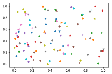
chars = "^<>vo+d"
x = np.random.rand(100)
y = np.random.rand(100)
markers = [chars[i%7] for i in range(100)]
for i in range(100):
    plt.scatter(x[i], y[i], marker=markers[i])
plt.show()
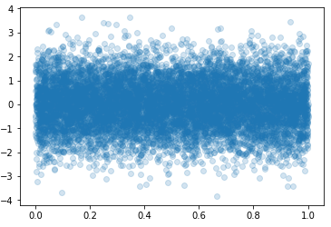
x = np.random.rand(10000)
y = np.random.randn(10000)
plt.scatter(x, y, alpha=0.2)
plt.show()
x = np.random.randn(10000)
y = np.random.randn(10000)
plt.scatter(x, y, alpha=0.2)
plt.show()

カラーマップを使う。
x = np.random.rand(100)
y = np.random.rand(100)
col = np.linspace(0, 1, 100)
plt.scatter(x, y, c=col, cmap="spring")
plt.colorbar()  #カラーバーの表示
plt.show()

カラーマップの一覧はここに。
参考:
